MAZID
Mazid Spice Packaging Design
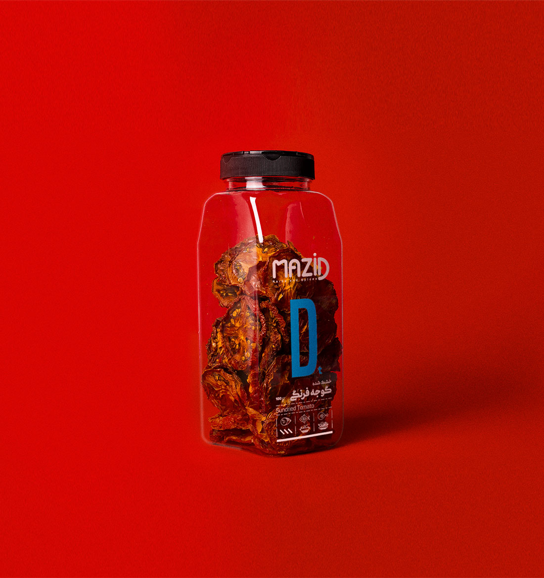
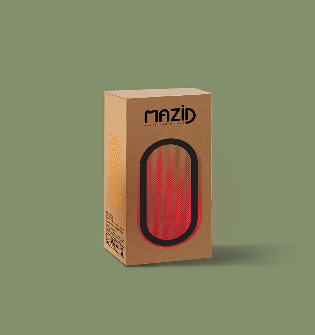
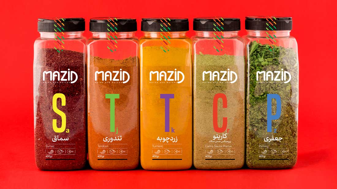
Mazid, a brand specializing in the production of high-quality spices and flavor blends, doesn’t just create taste—it crafts sensory experiences full of color, aroma, and richness. Our goal for this packaging project was to visually capture that experience, not through decorative complexity, but by letting the product speak for itself.
From the very beginning, we faced a key challenge: how could we reflect the rich visual diversity of spices without overwhelming the design? We didn’t want to hide the natural beauty of the spices behind excessive graphics. Each spice, with its own unique color and texture, already carried enough visual power. It just needed space to be seen and appreciated.
This challenge led us to a bold yet simple solution: a minimalist packaging approach that relies entirely on the natural colors of spices, paired with clean, typographic design. No extra illustrations, no ornamental distractions—just typography harmonized with spice tones, resulting in a visual system that feels both structured and organic.
In the end, Mazid’s packaging lets flavor take the spotlight. It’s a design that respects the essence of the product while delivering a refined, contemporary visual language that speaks to authenticity, quality, and taste—before the spice is even opened.